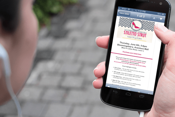
4 Nonprofit Emails that Look Awesome on Mobile

With around half of all emails being opened on a mobile device, nonprofits should be thinking differently about the way they approach their email marketing.
The inbox has changed, along with the way potential donors, supporters, and volunteers read and interact with your emails. Failing to make the change to a more “mobile-friendly” email experience could result in missed opportunities to grow your organization.
As complicated as it might sound, making the switch to a mobile-friendly email is actually pretty simple. In fact, we’ve talked to a number of nonprofits who have been using mobile-friendly emails and have seen some impressive results.
Join us for a free webinar, Design an Eye-Catching Email Campaign for Your Nonprofit in 15 Minutes or Less
Here are 4 examples of nonprofits with emails that look awesome on mobile:
1. Pajama Program

Tip for your next email: Use a single-column template
In the past, a multiple-column template used to be a popular design choice for nonprofits. It’s understandable. With so much going on in and around your organization, many feel that they need as much real estate as possible to keep people informed and up-to-date.
But here’s the thing…the multiple-column templates that make your emails look organized on a desktop or laptop, really have the opposite effect on a mobile device. While you may have been able to get away with squeezing schedules, links, and other pieces of content into an email sidebar in the past, on mobile, that content will be difficult to read and act on.
A single-column template saves your readers from having to pinch to zoom in order to read an update or click a link and, overall, gives them a much more enjoyable experience on a mobile device.
2. Alex’s Lemonade Stand

Tip for your next email: Provide a clear call-to-action
When it comes to generating donations or encouraging volunteers and supporters to get involved, it’s crucial that you’re making it easy for your readers to take action.
This is true when someone is reading your emails on a desktop and it’s certainly true when someone is accessing their inbox via a mobile device. One of the best ways to ensure that you’re making it easy for people to take action is by providing a single, clear call-to-action.
What is the number one action you want your reader to take? Do you want them to donate to your cause? Register for an event? Volunteer to help out?
Take this example from Alex’s Lemonade Stand. From start to finish, the goal of their email is clear. Every piece of content — whether its text, video, or a link to find out more — maps to a single, clear call- to-action. That’s how you inspire action on mobile and how you’ll be able to achieve your email marketing goals down the road.
3. Strong Women, Strong Girls

Tip for your next email: Be clear and concise in content and design
Designing emails that are clear, concise, and easy-to-read is by no means a new or revolutionary idea for nonprofit organizations. If you’ve been using email marketing for your nonprofit, you know that you only have a short window of time to engage someone after they open your email.
People are also likely to scan through your emails on a mobile device. That’s why it’s increasingly important to make your emails clear, concise, and easy to navigate.
Here are a few tips to keep in mind from Strong Women, Strong Girls:
- Use plenty of white space: Don’t blind people with huge blocks of text. Instead, use bullets and shorter paragraphs to break up text.
- Avoid tiny fonts: Make sure your text is easy to read. Use a minimum 11pt font for body text and 22pt font for headlines.
- Take it easy on images: Avoid the temptation to jam-pack your email with tons of images from your fundraisers or volunteer events. Apple’s iOS automatically enables images to display by default but, many other mobile device platforms like Android, turn images off by default. If your email has a bunch of images in it, they might display as chunks of white space.
4. Astoria Performing Arts Center (APAC)

Tip for your next email: Use mobile-friendly links
Links are hugely important for nonprofit email marketing. Whether you’re looking to drive donations, generate registrations, or encourage feedback, you need to make sure all of your readers can click to take the next step.
When it comes to mobile, your finger is the new mouse. A link that may be easy to click on a desktop can seem nearly impossible to click with the tip of your finger. If your readers can’t click your links, they’ll be far less likely to take action.
Here are a few ways you can make links more mobile-friendly from APAC:
- Make images clickable: By uploading a photo of their staff and including a call-to-action that asked readers to click the photo, APAC was able to not only make their emails more visually appealing to their audience but, was able to offer a more convenient experience to their entire audience.
- Put your most important link front-and-center: Remember, people will be scanning your emails on a phone or tablet. Make sure your link can be found right away.
- Use buttons: Instead of making readers pinch to zoom in on a text link, use a button to make your links easier to click on.
Join us for a free webinar, Design an Eye-Catching Email Campaign for Your Nonprofit in 15 Minutes or Less
The post 4 Nonprofit Emails that Look Awesome on Mobile appeared first on Constant Contact Blogs.
Comments are closed.
